ProgressBar
ProgressBar component is used to display the progress of a task.
To use the ProgressBar component, you need to import it from the ez-dashboard package.import { ProgressBar } from 'ez-dashboard';
Usage
import { ProgressBar } from 'ez-dashboard';
const Dashbaord = () => {
return (
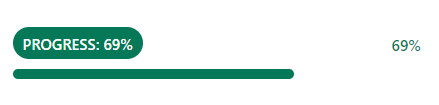
<ProgressBar value={69} />
)}
export default Dashboard;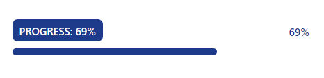
Props
The ProgressBar component has the following props:
* Value
* Color
* Radius
import { ProgressBar } from 'ez-dashboard';
const Dashbaord = () => {
      return (
              <ProgressBar value={69} color={'#FF0000'} radius={5} />
            )}
export default Dashboard;